New Adapt Theme - Continued
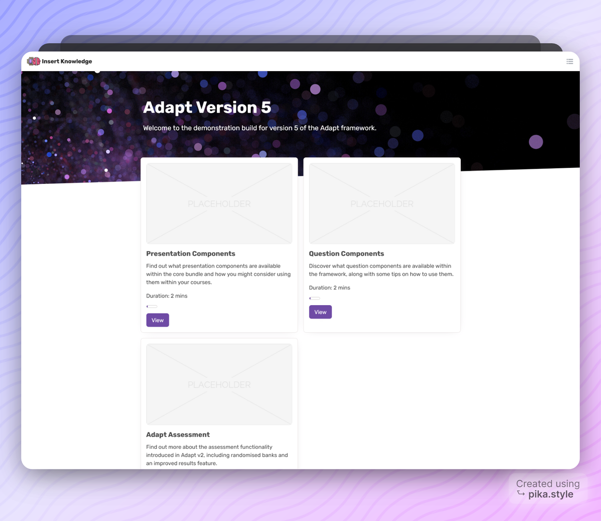
I've continued to work on the Adapt 'Modn' theme I posted about on March 2nd. I asked my partner if she liked the name 'Modn' and she said it sounded like I was trying too hard... and I agreed. So now I'm calling it Adapt Forge 🛠️.
I chose forge because I like to think of this theme as the building blocks for quickly building modern looking courses in the Adapt Framework.
You can read the first post here.
What's new?
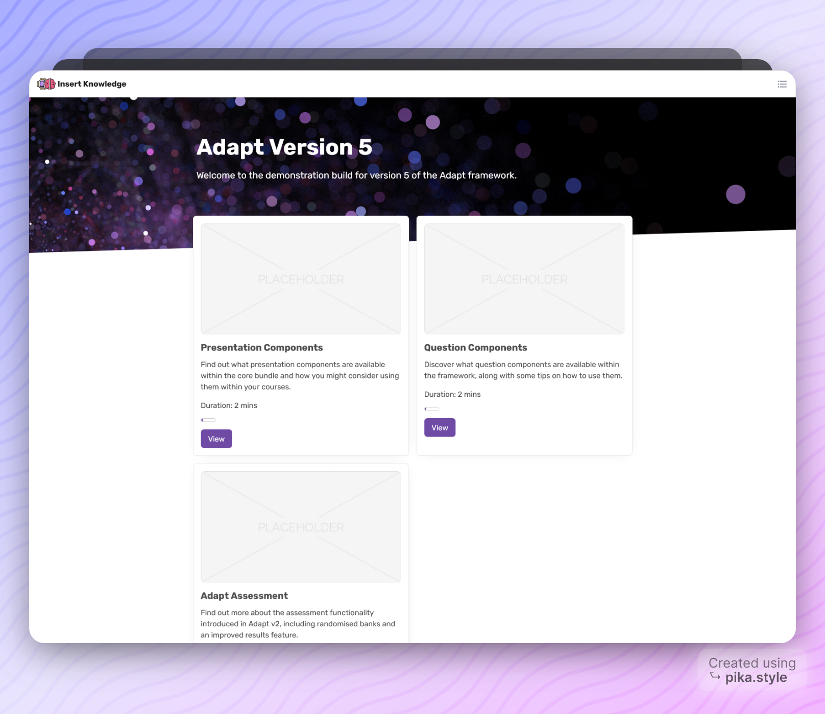
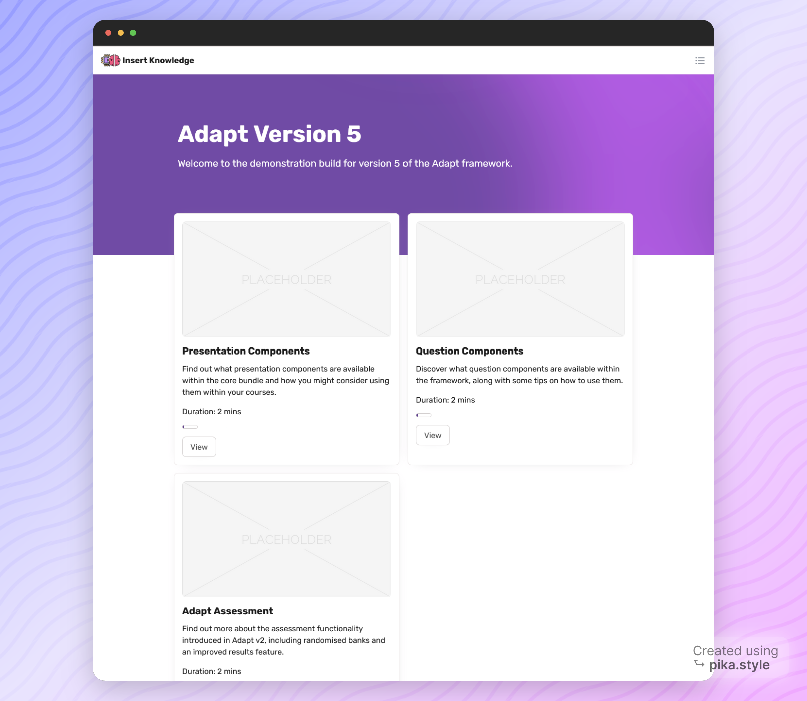
New Box Menu Header
I've made small tweaks here and there to improve the overall readability and fixed a few minor bugs. The most obvious change being the new slanted header. I felt like this helped to break out of the typical grid patterns.

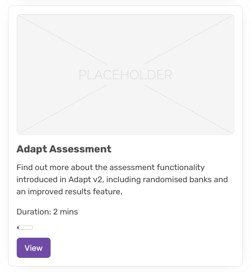
Purple Box Menu buttons
I've also made the main menu buttons purple to make them more distinct. These are the first elements we want a learner to interact with ideally.
That's it?
So, I didn't tell you the whole truth. The theme you're looking at is actually a whole new theme. I rebuilt it from the ground up. Why? Because there was a strange bug I couldn't figure out. The menu button in the nav bar would not be rendered if you imported the theme into a new course.
As it turns out I didn't even need to rebuild. I realised at the very end of the build that the bug was as a result of one missing line, not even a line... a word in the handlebars template for the nav.
{{import_adapt}}This import is responsible for making the global object in course.json available to the template. With it missing the button wasn't being rendered properly. It's all in the detail! Don't forget your imports.
You can view the latest demo of the theme here:
