New Adapt Framework / Authoring Tool Theme
In this post we'll explore a new Adapt Authoring Tool / Adapt Framework theme I'm building called Adapt Modn.


Over the past few weekends I've been working on a little side project I thought I'd share with you!
I'm building a new theme for Adapt which I've called Adapt Modn. Not sure how I feel about that name yet, but it'll do for now. In the future I'd like to launch this to the community plugins page, given that there are only a few offerings currently.
Why build a new theme?
Honestly, mostly for the fun and learning, but also because I feel like the Vanilla theme could look a little more modern with a few tweaks here and there. Which is exactly what I've done so far.
To make this more challenging here are the rules I came up with for this build:
- Follow the current Adapt Vanilla theme Design patterns as closely as possible (especially the structure of the code)
- Keep the additions of new lines of code to a minimum, changing existing code where possible
- Light touch in regards to the 'brand', this should be a blank canvas that allows the users content to be the centre of attention
- Rework the use of colour to draw attention to the interactive or important parts
- Compatible with the Adapt Authoring tool
Here's what I've changed so far
Side by side comparison. Click on the Images to Zoom in.
Adapt Vanilla Theme & Adapt Modn

Screenshots comparing Adapt Vanilla to Adapt Modn. Click on the Images to Zoom in.
Typography
In the world of UI design, from what I've seen we're moving away from hair thin fonts on the web, and we're not afraid to go big with titles anymore so the first thing I did was tackle the typography. I've made the headings bigger and bolder, and the body copy more legible (this is subjective of course but this is what I think works best). I've also changed the typeface to be 'Rubik' which feels a bit more modern and less 'corporate' to me.
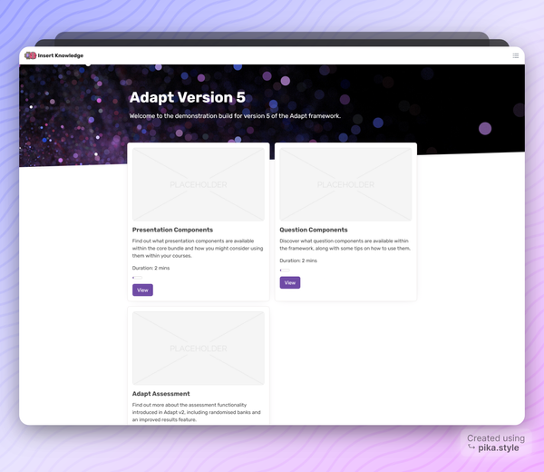
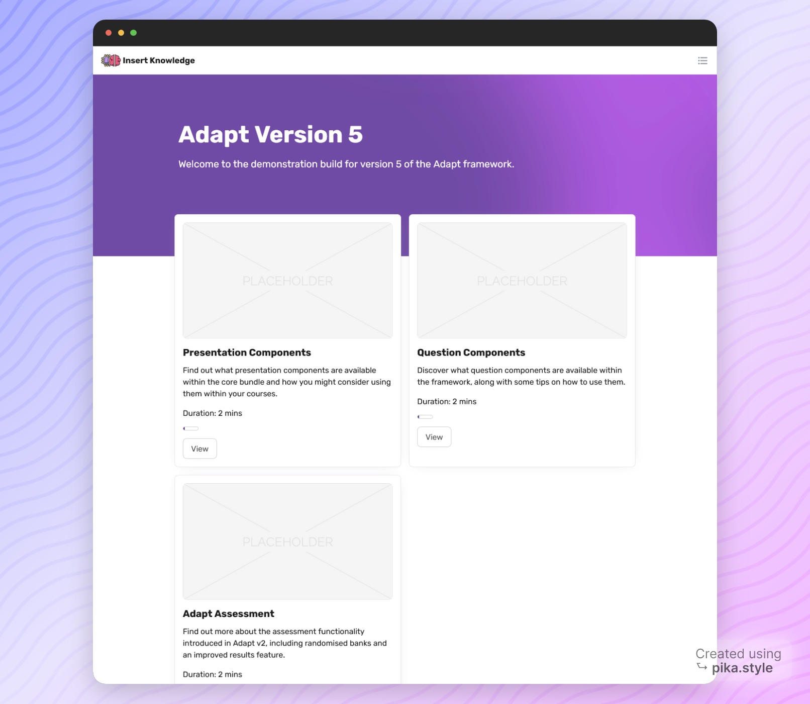
Here's a comparison from the start page:
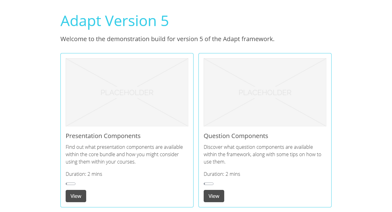
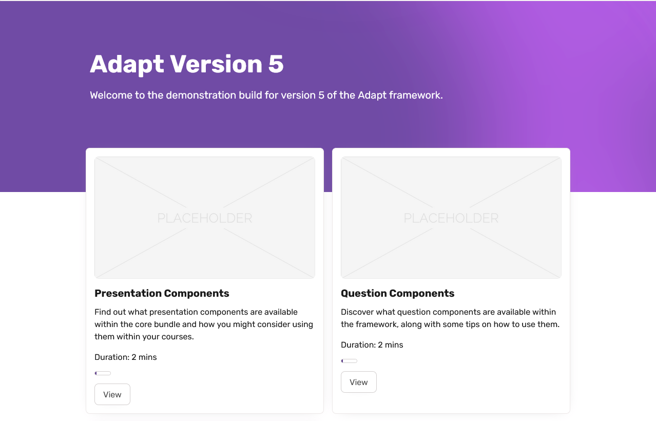
Screenshots comparing Adapt Vanilla to Adapt Modn
Box Menu Cards
I've made the menu cards less intrusive, removing the coloured stroke and only adding colour where it counts. Suchas The section progress indicator. I'm also debating making the buttons a primary colour here, rather than white, but this may mean modifying the Handlebar template classes rather than the button since this is a global change if I just modify the existing CSS.
I've also adjusted the menu item container so that it 'breaks' the grid a little, with the cards now overlapping the banner image / gradient.
Banner
There's a new banner gradient to take advantage of the offset applied to the cards, this was a stylistic choice more than anything, it just breaks the repeating grid patterns a little.
Nav Logo
I've added a logo to the navigation so there's room to make your mark with your own company logo.

Menu buttons
I've changed the menu button, I think it's important to keep the focus on the elements we expect the learners to use first, using strong colours and imagery. The menu in the top right is useful to have but in my opinion, it's lower in the hierarchy so I made it slightly less visible. The fact it's located in the top right is enough because most users know to check here for settings and a menu. I may darken the icon colour though in the next version, if this proves too subtle.
Menu
The Vanilla Theme menu, in my humble opinion... was in need of attention. The colour and the borders just made it feel old-fashioned. Here's my take on it:
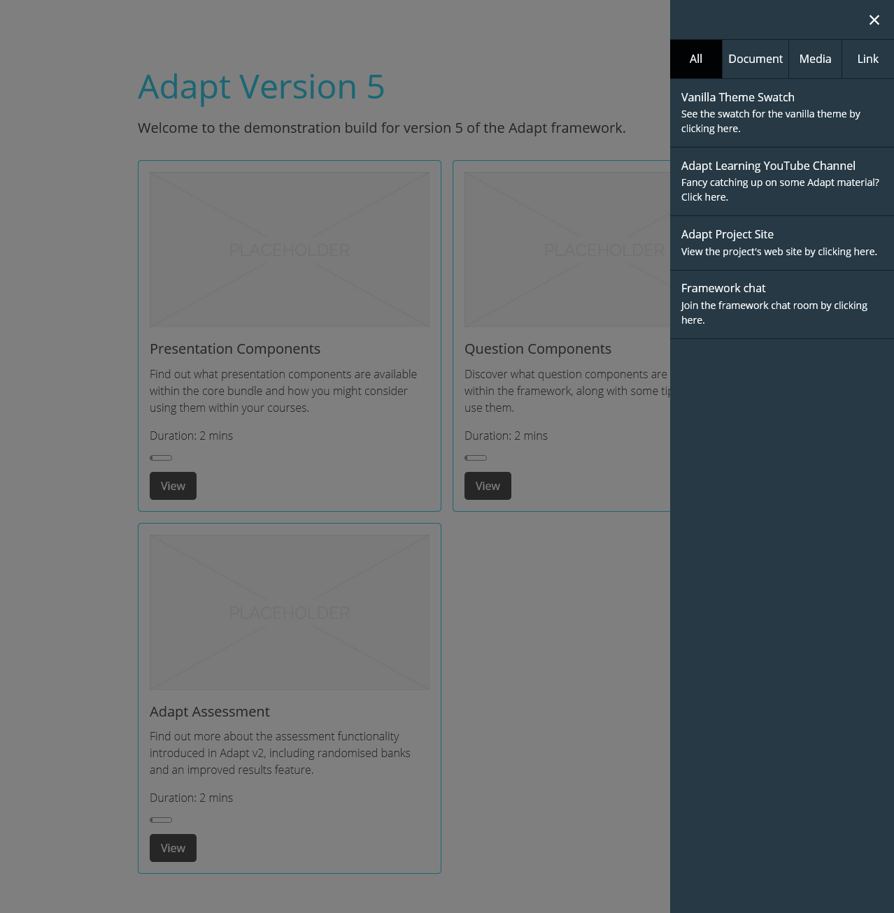
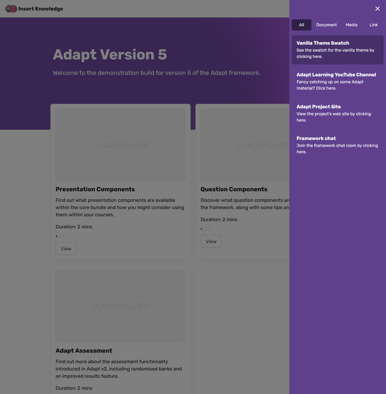
Screenshot comparing Adapt Vanilla Menu to the Adapt Modn Menu
Rounded Buttons and images
Since sharp edges are a thing of the past, at least for now. I've rounded the corners of images and buttons to add to that slick and modern appearance. You can also see how the bold headings really help draw your eye the key information in this example too.
Here's an example of both in the narrative component.
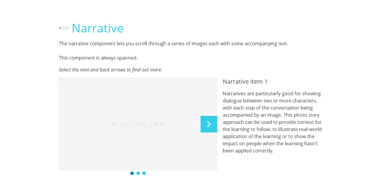
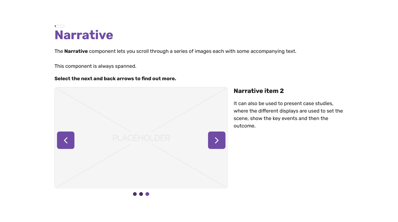
Screenshot comparing the Images and Buttons on the Narrative Component for Adapt Vanilla and Adapt Modn
Media Player
One of the more challenging parts of this adventure has been the update to the video player. Making sure it matched the rest of the theme. There are a lot of layers that make up the media component. Here's how it looks in Adapt Modn vs Vanilla.
Really you could argue the use of the primary colour isn't necessary for the player here, because the content should get the focus, so I'm tempted to change this to white or transparent.
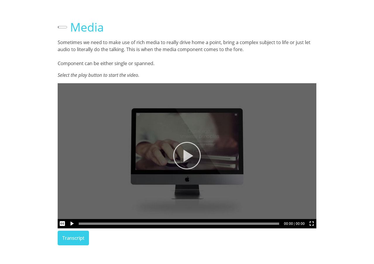
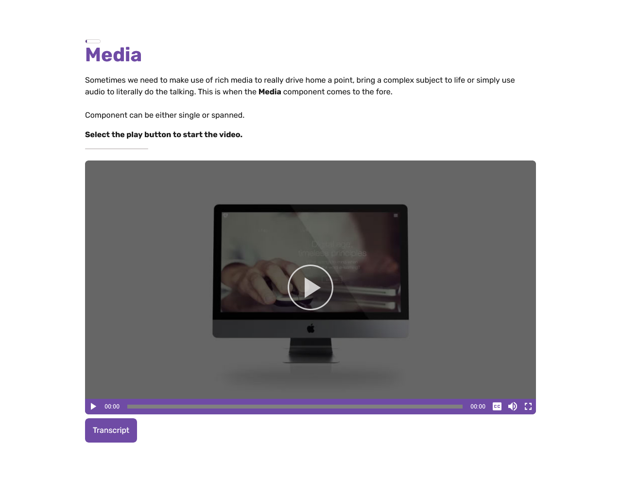
Screenshot comparing the Adapt Vanilla media player to the Adapt Modn media player.
Conclusion
That covers most of the changes I've made for now. You can check out a working demo of this site in it's latest form here.
https://adapt.insertknowledge.com/